Devlog 10: Polishing our weapons
End of the polish stage
As our last feedback moment nears, we have added some bips and bops to our game that help it feel more vibrant. We've also fixed some more major issues, such as clouds not spawning in for a long time at the beginning of the game, the hawk getting a bit confused about who it is supposed to hit, special effects facing the wrong direction and wonky UI elements. Controller vibrations have also been added to add to the immersiveness of the game, indicating when the player joins, shoots, gets hit and dies. The UI elements have gotten some animations too - the end screen has elements flying in and the main menu background is a slowly panning icy pattern. There's always more stuff we could improve, but at this stage, this is the best we could do, so we hope you will enjoy it as much as we have enjoyed making it !
Last week we uploaded a build that could easily crash at the end of a game. These were game breaking bugs and had priority. Polish regarding programming was towards the feel of the game and menus. From button selection, to effects that needed to be implemented, and the new and improved end screen and selection screen.
ART
There's a lot of small things we did this week, so here's a bit of a scattered rundown of the changes made:
The clouds have become softer, as we bevelled their edges :
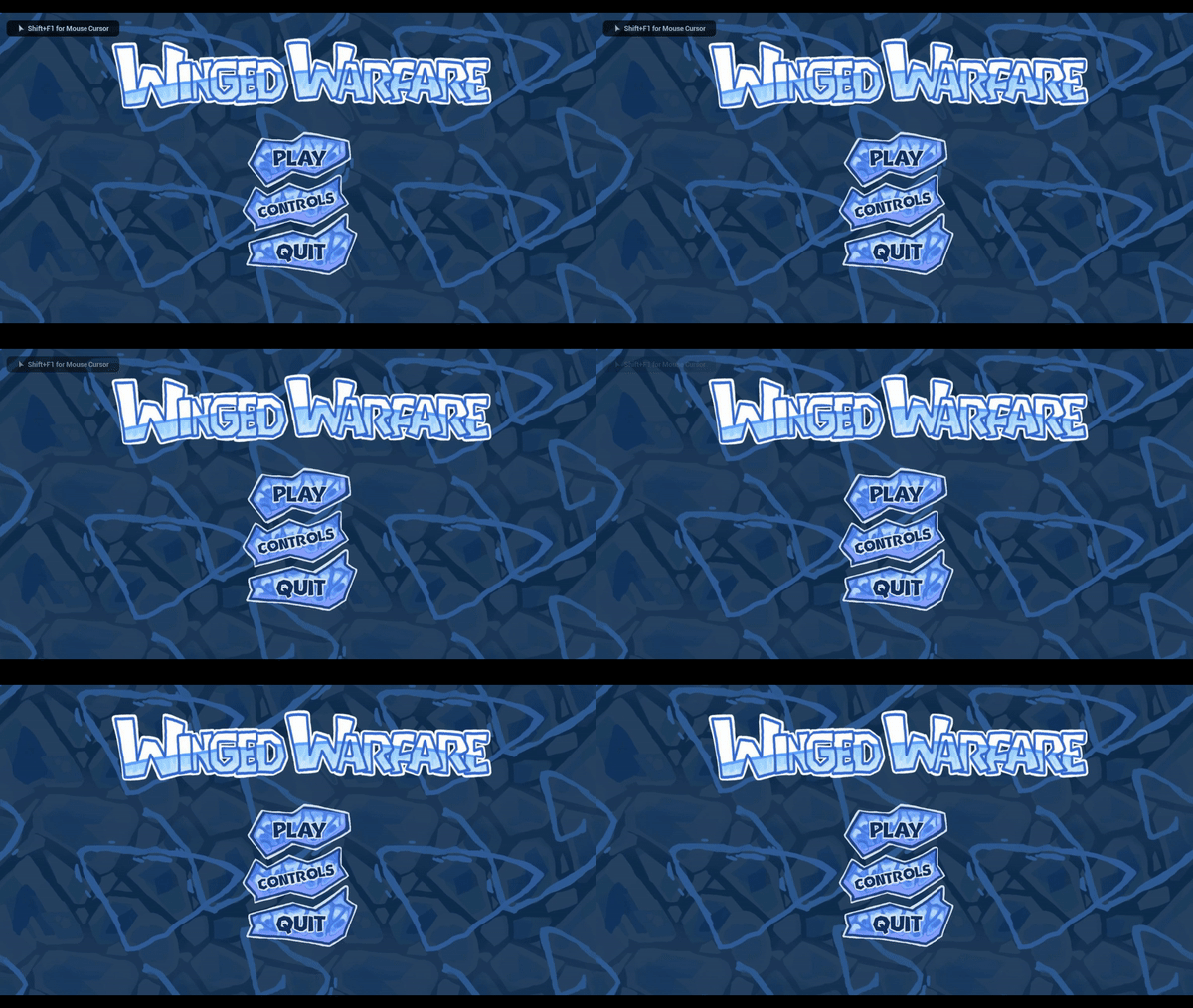
The Main Menu background, instead of being a static image, is moving now!

(the animation isn't that choppy, it's the gif compression settings)
The stamina bar now fits the UI and style of the game aswell (icy).
The background of the player in player seleciton has been changed from a paint splotch to a shape more in par with the style of the game aswell (you guessed it, icy and angular :D)
To spice things up, our combat zone has brand new post process volume settings as well! Leaning heavily on that vignette and tweaking the colors, and keeping the outline for all the important foreground elements of the game to help keep track of what is going on in the player area.
So here is a little comparrison of the scene without, and with post process volume.
RFX
For this week we have made some little changes to the particles in the game that better improve the game's visuals, here is a little sum up of them:
The first things that were introduced are glowing particles for pickups in order to be a better visualization of them:
Another thing that was improved was the explosion. As the previous version felt a bit too flat and a bit uninteresting. Therefore, additional depth was introduced that is mostly visible at the end of the explosion. Additionally, a bit of an outline has been created, which is the original particle but scaled a bit with very low alpha.
In order to get the feeling of cold and windy environment an area particle was created, which introduces bit of stylized wind and snow.
Lastly, to get a better visual representation of losing the balloons, balloon popping effect was introduced:
Here the red pieces will change their colour based on the colour of balloons.
Files
Get WingedWarfare
WingedWarfare
| Status | Released |
| Authors | mikailkahya, aprinz, AnnijaB, shlab |
More posts
- The destinationMay 28, 2024
- Devlog 9: Last HurrahMay 15, 2024
- Devlog 8: Just beyond the horizonMay 09, 2024
- Devlog 7: Switching to next gearMay 01, 2024
- Devlog 6: End of the first sprintApr 24, 2024
- Devlog 5: Navigating the skiesApr 17, 2024
- Devlog 4: The start of a marathonMar 28, 2024
- Devlog 3: Time for warfareMar 20, 2024
- Devlog 2: Into the AntarcticMar 14, 2024

Leave a comment
Log in with itch.io to leave a comment.